Phonix: A Dramatic Display Font for Bold Digital Branding
I was deep in the final round of a landing page redesign for a boutique coaching practice—clean layout, intentional whitespace, strong visual rhythm—and the hero headline just felt… quiet. Not wrong, exactly. Just missing that spark of distinction. That’s when I dropped Phonix into the mockup.
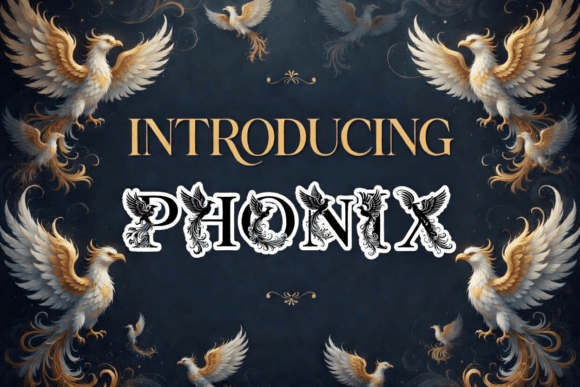
Right away, it changed everything. Phonix isn’t just another decorative font—it’s a typeface where the letterforms themselves tell a story. Each character carries intricate, high-contrast black-and-white feathered details, evoking the mythic phoenix without leaning into cliché. The sharp serifs and dramatic weight shifts give it presence, but it never feels cartoonish or dated. It feels designed—like a custom illustration built for typography.
In practice, I used Phonix for the main headline (“Rise Into Your Next Chapter”) and the subheading (“A 6-week clarity program for purpose-driven founders”). No extra graphics needed—the font *is* the graphic. On desktop, it held its own over a soft gradient background. On mobile? I switched to a slightly larger relative size and added subtle letter-spacing to keep the feathered details legible—not too tight, not too loose. It worked because Phonix is built for impact, not endurance: it shines in short bursts, not long paragraphs.
That’s key: Phonix is a display font, not a text font. It’s made for moments that need emphasis—hero sections, section dividers, campaign banners, course titles, portfolio project names, or even as a subtle accent in a logo lockup. I tested it in a few other spots across the same site: as a decorative “Welcome” banner on the client’s blog homepage (paired with Inter for body copy), as the headline on a limited-time offer card (with bold sans-serif buttons beneath), and even scaled down for a small “New Cohort Opening” badge in the navigation bar. Each time, it added personality without sacrificing clarity.
Readability is where intention matters most. On light backgrounds, Phonix pops with crisp contrast. Over image overlays, I applied a subtle semi-transparent dark scrim behind the text to ensure the feathered strokes remained visible—even at smaller sizes. On dark mode, I confirmed the font renders cleanly (no anti-aliasing artifacts) and kept the weight consistent with the light theme. No surprises: it’s well-hinted and optimized for web use.
Pairing Phonix thoughtfully made all the difference. I landed on Inter for body copy and UI labels—its open counters and neutral warmth balanced Phonix’s drama without competing. For a more editorial feel—say, on a digital brand kit page—I swapped in IBM Plex Serif for subheads and pull quotes. The contrast between Phonix’s illustrative energy and a refined serif created visual breathing room and hierarchy. Avoid pairing it with other decorative fonts or heavy scripts; Phonix doesn’t need company—it needs contrast.
I also checked what came in the package before deploying: multiple weights (Light, Regular, Bold), true italics, OpenType features like stylistic alternates and ligatures, and solid multilingual support—including Latin Extended-A for common European accents. No missing glyphs mid-sentence. And yes—it’s a commercial font with clear web licensing, so I verified the license covered self-hosted WOFF2 files and usage across the client’s live domain and marketing emails. No last-minute legal hiccups.
Where does Phonix truly elevate a digital experience? In places where users form first impressions fast. Think of a product landing page where the headline must communicate ambition and transformation in under three seconds. Or a creative portfolio where the nameplate should feel like a signature—not just a label. Or a boutique online store launching a seasonal collection titled “Ash & Ember”—where Phonix turns a simple banner into a mood board.
It’s not for every element. I wouldn’t use Phonix for form labels, pricing tables, or navigation menus. Its strength lies in controlled emphasis—not utility. But when you need to signal confidence, artistry, or renewal, it delivers with quiet authority. One designer friend used it for a wellness retreat’s email header and told me attendees paused longer on that one line than any other part of the campaign. Not because it’s flashy—but because it feels *meant*.
Responsive behavior was predictable: Phonix scales cleanly across breakpoints, especially when paired with fluid typography CSS (clamp() values for headline sizes). On small screens, I avoided stacking multi-line Phonix headlines—instead opting for single-line impact with generous line-height and spacing. Buttons? Only for primary CTAs with very short labels (“Begin Now”, “Join Us”) and ample padding. Never for icon-only actions or micro-interactions.
What surprised me most wasn’t how striking Phonix looked—but how much it simplified my design decisions. Instead of layering icons, illustrations, or custom SVGs to convey theme, the typeface itself carried the narrative weight. That kind of efficiency is rare in decorative fonts. Most demand extra assets to feel complete. Phonix feels complete on its own—then invites thoughtful restraint around it.
If you’re building a digital brand that values craftsmanship over clutter, or crafting a landing page where tone matters as much as function, Phonix is worth testing early—not as decoration, but as deliberate voice. It’s not about making things look “pretty.” It’s about making them feel unmistakably *yours*.
Just remember: let it lead, then step back. Let the feathers speak. Let the contrast breathe. And always pair it with something humble—so the majesty has room to land.